Online learning has blown up and is more popular today than ever before. With so many people using computers and smart devices, distance education has gotten way more accessible and practical. eLearning is here to stay, and there are more and more chances for multimedia training.
Good writing is key to good learning. But a successful online course is about more than just content. User-friendly design is essential since your courses target students worldwide. So every part of your eLearning course needs to be optimized for easy navigation, usefulness, and accessibility. To set you up for success, we’ve put together the best tips to remember when making a compelling and intuitive online course.
Tried and Proven Ideas to Make Your eLearning Course User-Friendly
A user-friendly eLearning is engaging and highly intuitive. In this article, we mention nine ideas you should follow for creating user-friendly eLearning courses:
1. Know Your Audience
A significant first step in course creation is to learn about your audience. Course designers sometimes make the mistake of generalizing their course content. Content generalization is widespread because it allows getting information out quickly and with little effort. This method disregards your audience’s existing knowledge and capabilities.
In order to avoid such mistakes, a best practice is to research your audience thoroughly. A good course designer must constantly remember whom they are writing for and their current level of knowledge. Finding the answers to these questions can help you write with a clear goal and avoid irrelevant information.
2. Plan Things Out
The next step in the process is to make an outline. This helps you form a mind map of the information you want to include. It also lets you organize your thoughts and formulate a strong structure for the course curriculum.
An eLearning curriculum refers to all activities which frame the entire course together. This includes lessons, quizzes, and assignments. Building an exemplary course curriculum takes great planning, organization, and research. The best curriculum informs its audience about learning outcomes, how to approach the course, and access course material online.
To help us prepare this structure, we need to conduct a “needs analysis.” A needs analysis defines lackings or problems and helps pinpoint causes and solutions. The resulting outcome becomes the blueprint for the course. It enables you to set objectives for your learners to achieve.
3. Perform Content Analysis
Now that we have figured out the right questions, we need to find the right answers. Questions like why is this training necessary and who is our target audience?
To find the answers, we now need to analyze our content. Content analysis is a set of activities that help designers understand how to achieve learning objectives by structuring and sequencing the information accordingly.
A thorough content analysis should answer the following:
- The knowledge and skills your learners need to solve a problem
- Define each step required to solve that problem by creating smaller, more easily attainable objectives
- Develop an idea of the type of information that will be most impactful at each stage of the course.
Through careful analysis, we can learn how interconnected and essential each part of our content is and how information should be arranged.
4. User-Friendly Navigation Control
A good navigation setup allows learners easy access to vital information without any navigational hurdles. When designing navigation, we must understand both site and course navigation.
A few things to consider when designing your course and site navigational controls are:
Schedule Lesson Delivery
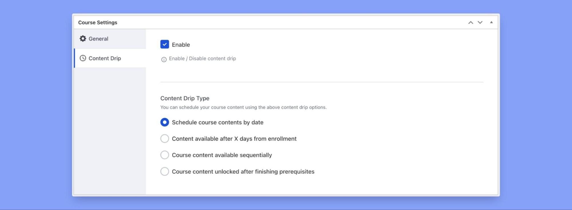
Schedule your content by making it available over a specific period or only when particular prerequisites are met.
Pagination
Start by splitting the overall course list into smaller groups. Having an equal number of items on each page is best. Decide on the appropriate number of items to display per page. This number should strike a good balance between content legibility and ease of navigation.
Additionally, adding “Pagination Control” allows users to move forwards and backward through different pages. It lets users skip straight to the set’s beginning or end or to specific pages.
Layout
Creating an aesthetically pleasing learning environment is essential for eLearning. However, it should not come at the cost of navigation friendliness. A common obstacle is a confusing eLearning course layout.
A well-crafted course layout should enable learners to access necessary information quickly. This allows your audience to focus on eLearning instead of trying to understand the icons or find buttons hidden among cluttered pages.
An easy way to integrate all these navigation controls is to use an efficient Learning Management System (LMS). Our number one choice is Tutor LMS.
Tutor LMS gives users complete control over lesson plans, layout, and pagination options. Execute your course plans efficiently, display your desired number of courses per page, customize the number of columns per row, and do much more.
Scheduling content, or Content Drip in Tutor LMS, is a breeze. Tutor LMS allows users to schedule content based on four different criteria. To learn more about this very exciting feature in detail, check out this dedicated article here.
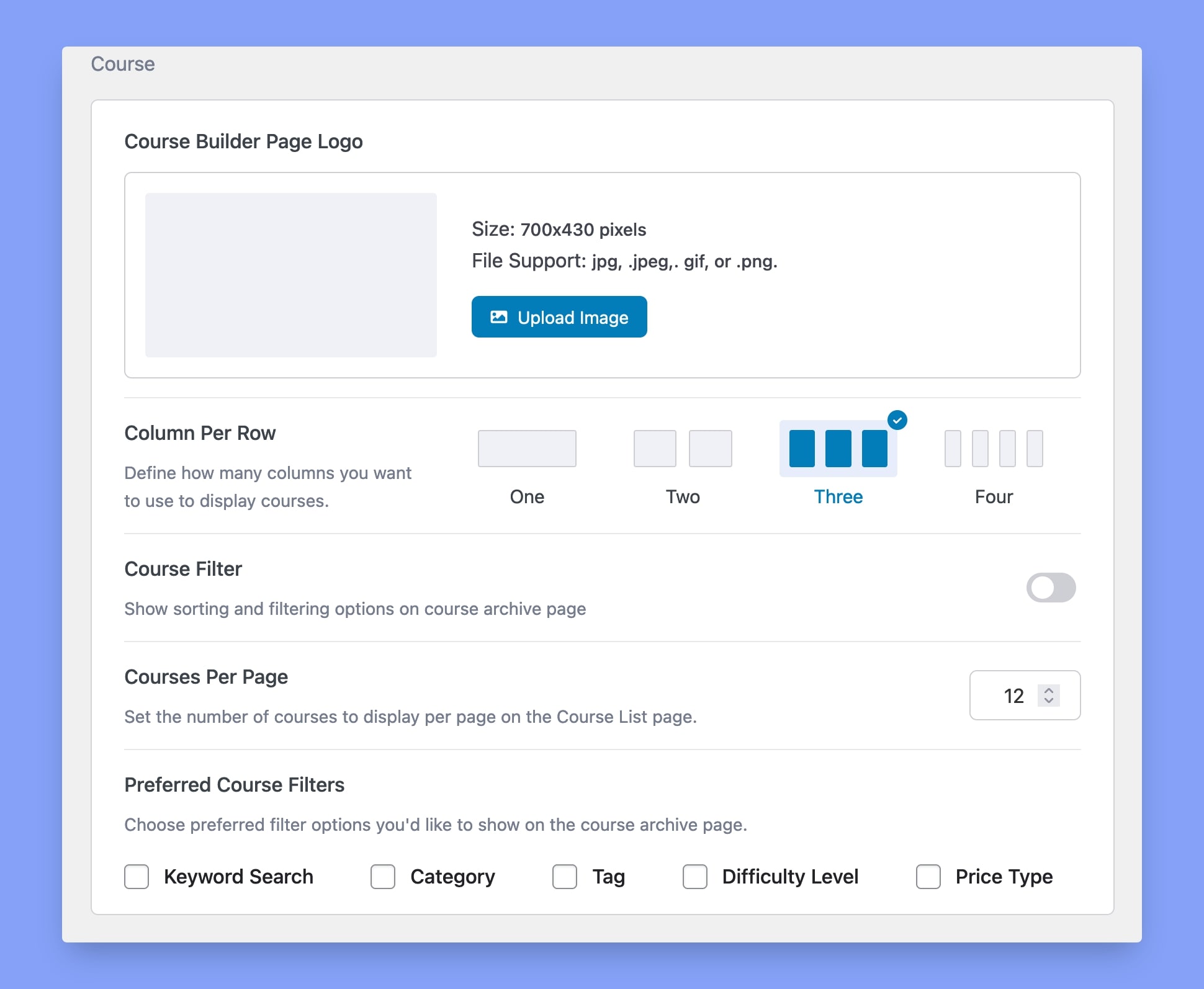
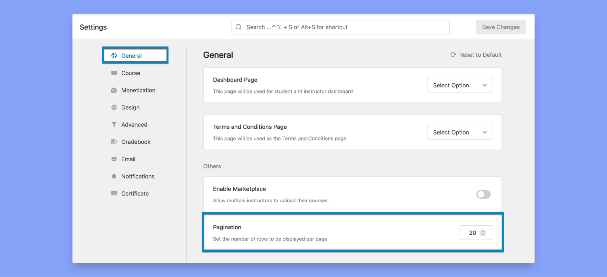
To customize the layout of the course list page on your eLearning site in Tutor LMS, navigate to Dashboard>Tutor LMS>Settings>Design.
Layout customization in Tutor LMS makes it easy to personalize how courses appear to your audience. You can fiddle with the number of columns and courses appearing per page. Also, you can assign filters to make courses easier to find.
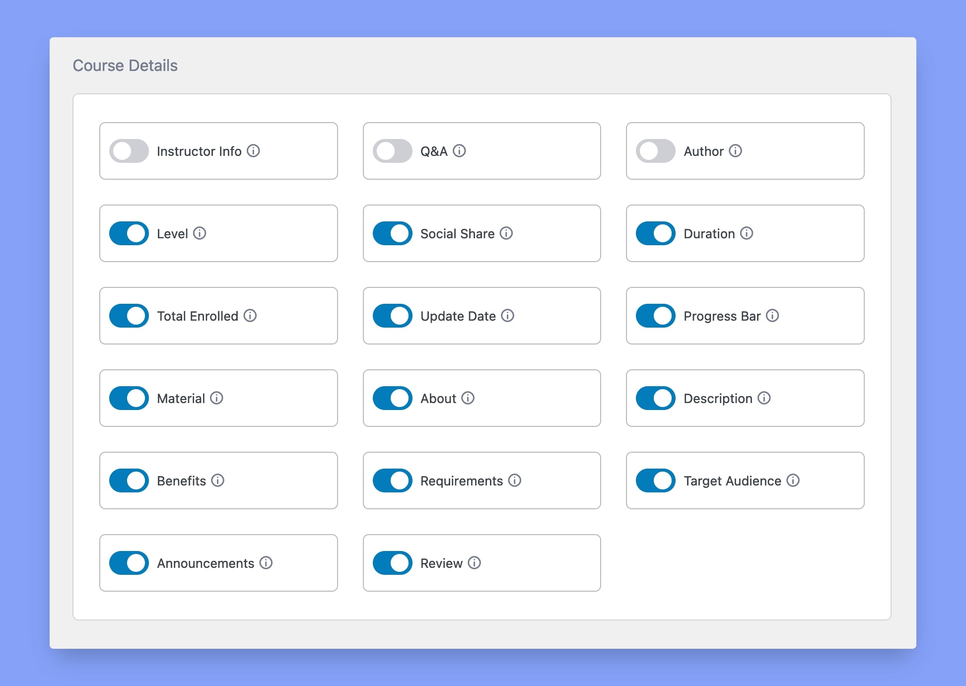
Display or conceal optional course details giving instructors more flexibility to showcase their courses.
Access the Pagination option to set the number of courses to be displayed per page.
Add your personal touch and convert your eLearning site into a sanctuary for sharing knowledge.
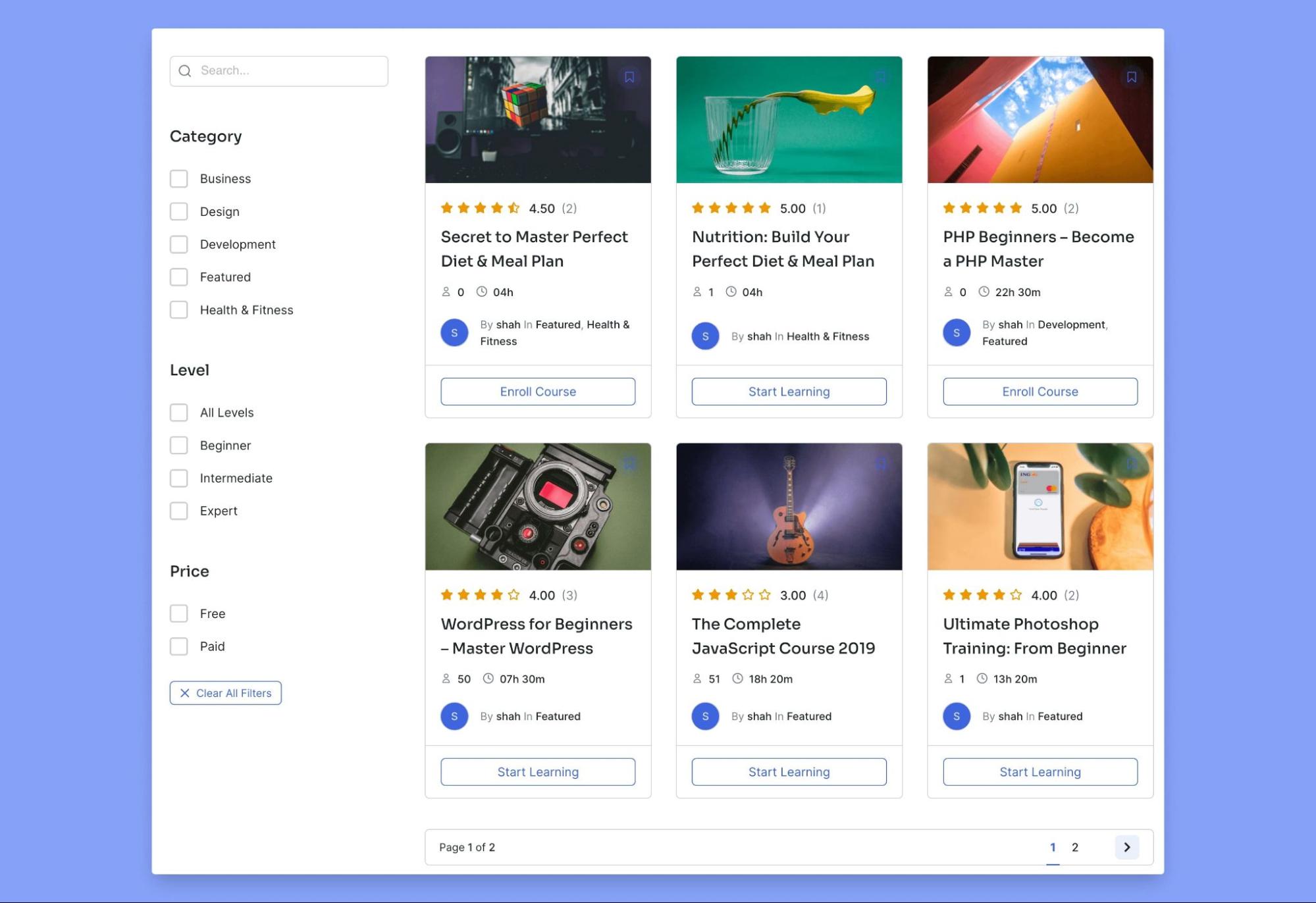
5. Use an eLearning Template
Building an interactive and visually appealing course without technical and design knowledge can be challenging. You’ll need a theme to beautify the look of your eLearning website that can not only save you a lot of time and resources but also enhance the overall learning experience for students.
One of our favorites is the Tutor Starter free template for Tutor LMS. Its unified design system offers users a smooth and user-friendly experience. It provides multiple pre-built home page layouts to choose from and style your eLearning site.
6. Create an Introductory Video
Adding an engaging introduction video is an easy way to grab the attention of your potential students. A quality introductory video helps to showcase your knowledge and make an excellent first impression.
Moreover, the Intro video provides students with a subtle and short overview of the course and the instructor themselves.
Your course Intro video should be short and engaging, reflect your personality, mention your relevant achievements, and provide motivational reasons why students should choose your course.
7. Be Transparent About Learning Outcomes
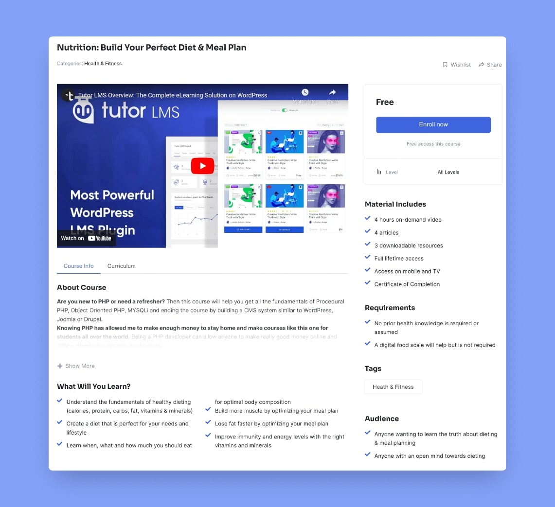
Learning outcomes define the knowledge, skills, or expertise that the learner will gain from the course. To construct a compelling course overview, designers must structure and showcase course curriculum details, objectives, and requirements to build a clear learning outcome overview.
With the help of an efficient LMS, organizing all this information can be much simpler. Tutor LMS makes structuring your course curriculum and outlines easy and visually stunning. This helps your audience visualize a course roadmap and makes course objectives seem more achievable.
8. Make Materials Interactive
The best option for content delivery depends on the desired outcome from each separate module of the course. So in creating a practical online course, a designer should be well-versed in using many content delivery methods.
Text-based content is by far the most common. Although widespread, its effectiveness in delivering knowledge can sometimes be very limited. A combination of text-based and Rich Media Content, like audio, images, and videos, should be used to illustrate complex ideas.
A good LMS offers a full range of options to deliver content effectively, and Tutor LMS is an excellent example of that! It is a capable system that allows users to upload and integrate most media file types in their courses.
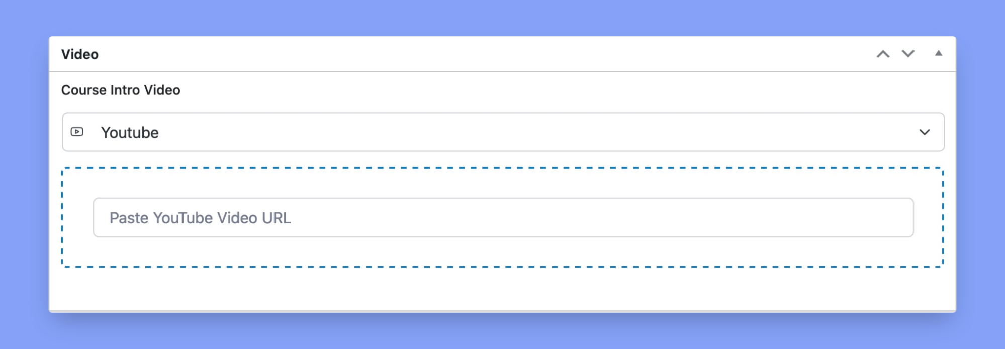
To enable support for all available video sources in Tutor LMS, navigate to Tutor LMS> Settings > Course > Video. Select your preferred video sources, and click Save Changes.
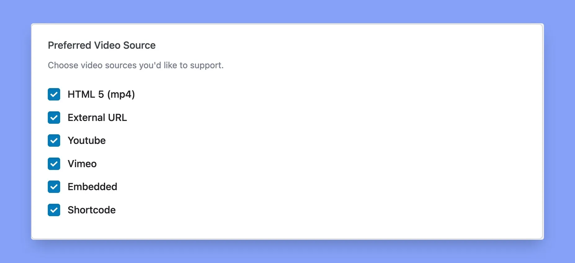
Once the changes have taken effect, you can choose your preferred video source from the course creation page.
9. Create a Community
Even though great course content is essential, but what really makes students stick around is the community you build. If you want to take engagement to the next level, think about creating a community hub within your website.
However, creating a community is a breeze if you use a community plugin like FluentCommunity. It will turn your WordPress site into a social hub, where students can chat, join interest groups, exchange tips, and form lasting connections. By bringing your learners together, you’ll create a space where they feel part of something bigger and increase the overall course retention rate.
10. Test, Test, and Test!
Even experts can make mistakes! Before publishing, please proofread all course content and materials, preferably a few times. Make sure to check all your facts, spelling, and grammar specifically.
Having at least one other person go over your content is highly recommended. Reviewers can offer their unique perspectives to help catch errors that may have gone overlooked.
Wrapping Up
Congratulation on having your course ready to be published; however, the work doesn’t end there. To make sure your course continues to thrive, you can take extra steps to keep adding more value. Learners highly appreciate it when course creators offer some form of support where learners can get help. Live chat, email, and phone calls are all excellent support services you can offer. If you want to learn more about how to launch your course successfully, read our article here.
One more thing to remember is that your courses will need revisions as time goes by. These modifications can be based on user feedback, availability of new information, adapting to recent technology, etc. Over time, these edits and revisions will make sure your courses do not become obsolete.
Start Using Tutor LMS Today
Ready to take your online courses to new heights? Download Tutor LMS now and enjoy a journey of eLearning excellence.
