Instructor Homepage
When you log in to the Modern Instructor Dashboard, the first screen you land on is the Home page. This page serves as your central overview, bringing together the most important information about your courses, students, and earnings in one place.
The Sidebar Navigation
The sidebar on the left side of the screen is how you move between the different sections of the dashboard. It is always present, no matter which page you are on.
At the top of the sidebar, your platform’s logo and name are displayed. Below this, the sidebar lists the following sections:
- Courses: Manage your published, draft, pending, and scheduled courses.
- Announcements: Send messages and updates to students enrolled in your courses.
- Quiz Attempts: View all student quiz submissions, scores, and results.
- Assignments: Track and review student assignment submissions.
- Discussions: Read and respond to student discussion threads.
- Live Classes: Schedule and manage live sessions via Google Meet or Zoom.
- Certificate: Manage course completion certificates.
- Analytics: Access detailed reports on earnings, students, and course performance.
The section you are currently viewing is highlighted in the sidebar, so you can always tell where you are at a glance. Each section is covered in detail in its own part of this documentation.
Metric Cards
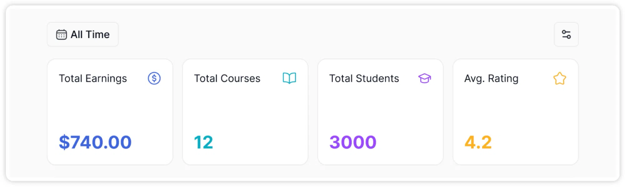
At the top of the Home page, four cards display your most important performance numbers. These are:
- Total Earnings: Your cumulative revenue from all course sales, shown in green.
- Total Courses: The total number of courses associated with your instructor account, shown in blue.
- Total Students: The total number of students enrolled across all your courses, shown in purple.
- Avg. Rating: The average star rating your courses have received from students, shown in gold.
These four numbers give you an immediate snapshot of your overall standing as an instructor, without having to navigate anywhere else.
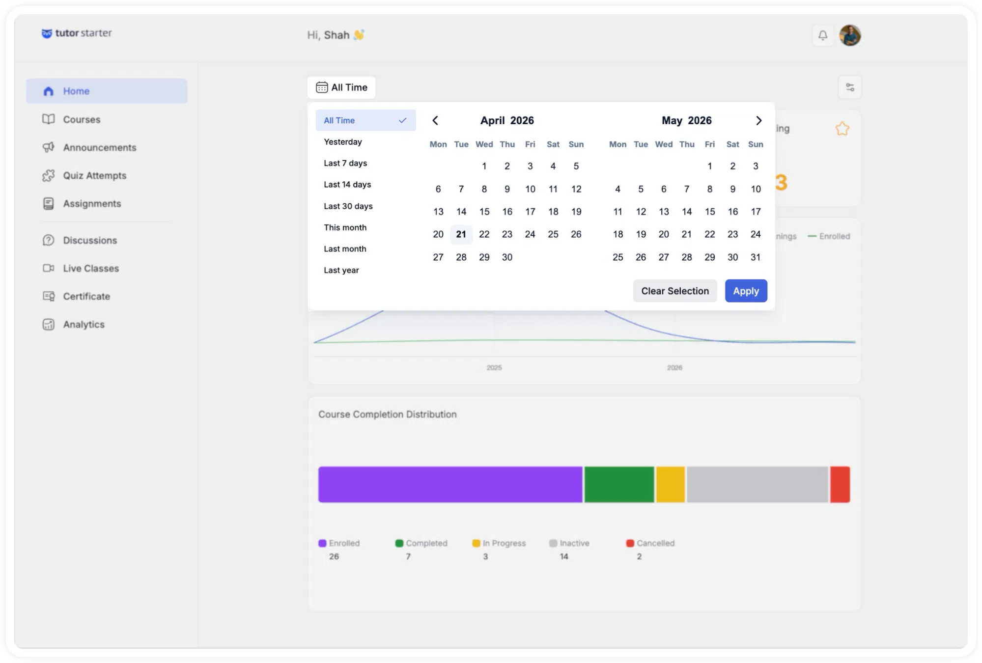
A date range filter sits above the metric cards, defaulting to All Time. Clicking it opens a dropdown with these options: Yesterday, Last 7 Days, Last 14 Days, Last 30 Days, This Month, Last Month, and Last Year. Selecting any option updates all four cards to reflect data from that period only.
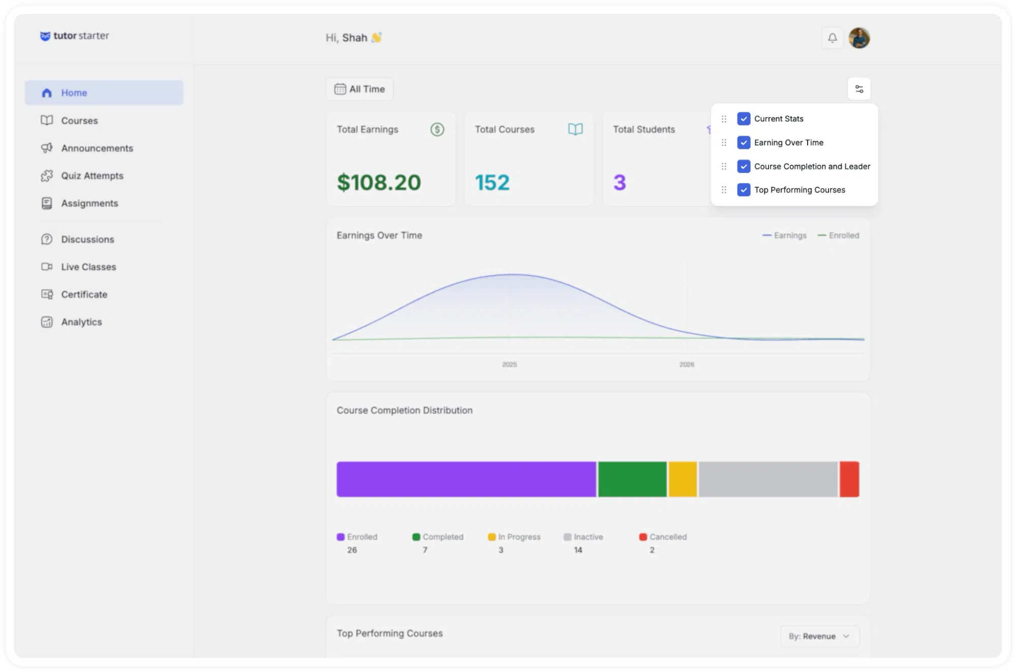
To the right of the date filter, there is a small Settings icon, which allows you to adjust what is displayed in the cards section.
Earnings Over Time Chart
Below the metric cards is the Earnings Over Time chart. This interactive graph allows instructors to track their financial performance. Users can filter the displayed data using the provided timeframe options.
This is a dual-line chart that plots two measurements across multiple calendar years:
- The dark blue line tracks your earnings.
- The green line tracks student enrolments.
A legend in the top-right corner of the chart labels both lines. Moving your cursor over any point on the chart brings up a tooltip showing the exact date and the corresponding value at that point.
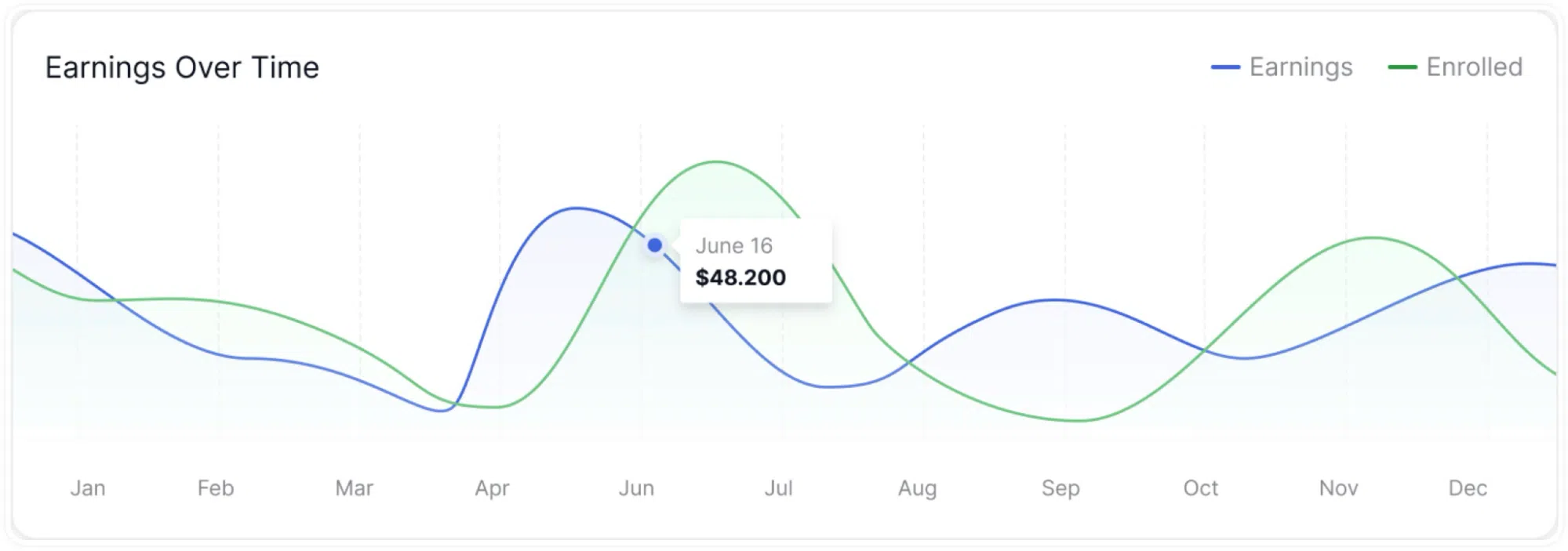
The Earnings Over Time chart also updates in line with whatever date range you have selected using the filter above the metric cards. If you select “Last 7 Days,” the chart will adjust to show data for that period rather than the full year.
Course Completion Distribution
Below the earnings chart is the Course Completion Distribution section. This displays a horizontal stacked bar that visually represents how your total enrolled students are distributed across five states:
- Enrolled: Students who have signed up but not yet started.
- Completed: Students who have finished the course.
- In Progress: Students who are currently working through the content.
- Inactive: Students who are enrolled but have had no recent activity.
- Cancelled: Enrolments that have been cancelled.
Each segment of the bar corresponds to one of these states. Below the bar, a legend displays each category by name and colour, alongside its exact count. You do not need to hover or interact with the bar to read the numbers, they are displayed directly beneath it.
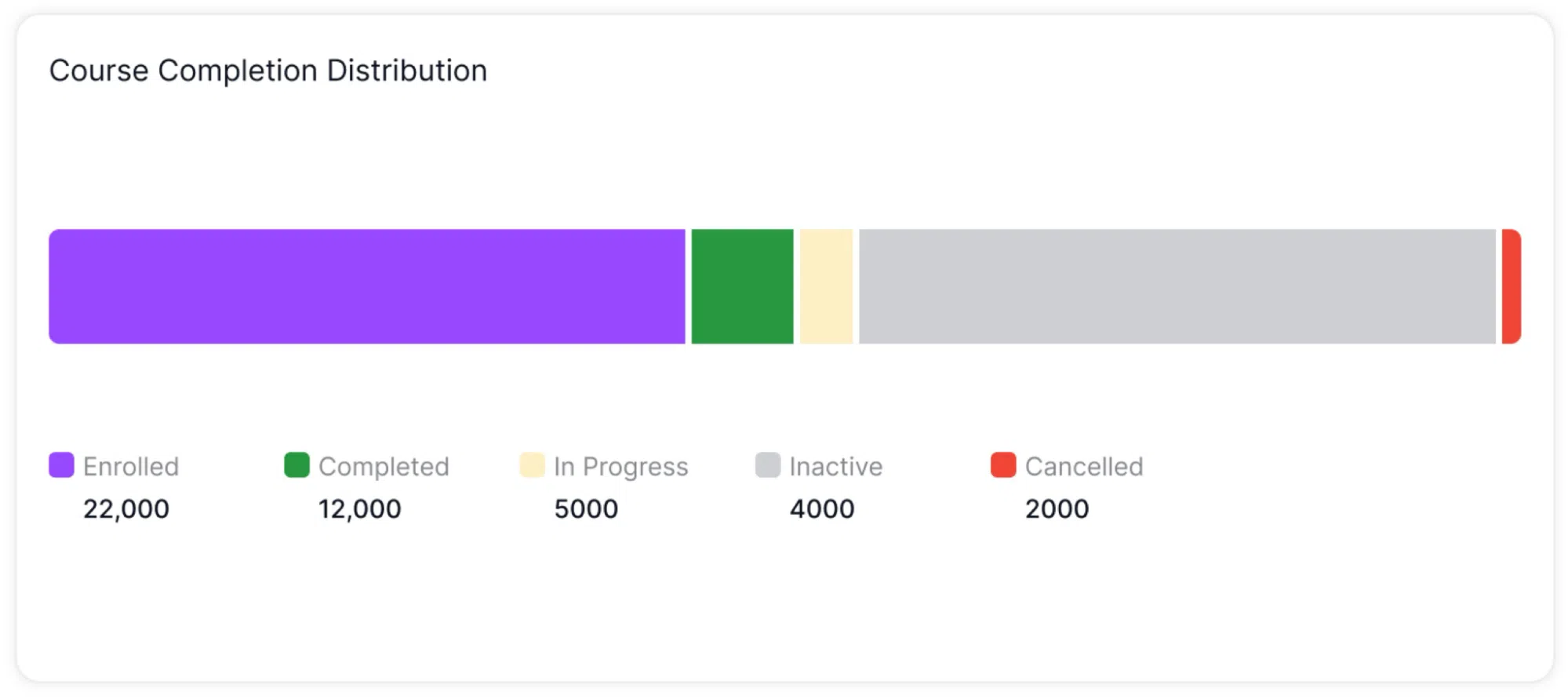
This section is useful for understanding the overall engagement level across your courses. For example, a large inactive segment relative to completed or in-progress students may indicate that certain courses need follow-up or re-engagement.
Top Performing Courses
Further down the Home page is the Top Performing Courses section. This is a ranked list that shows which of your courses are performing best. By default, the list is sorted by Revenue, but you can switch to sorting by Student count using the dropdown control in the top-right corner of this section.
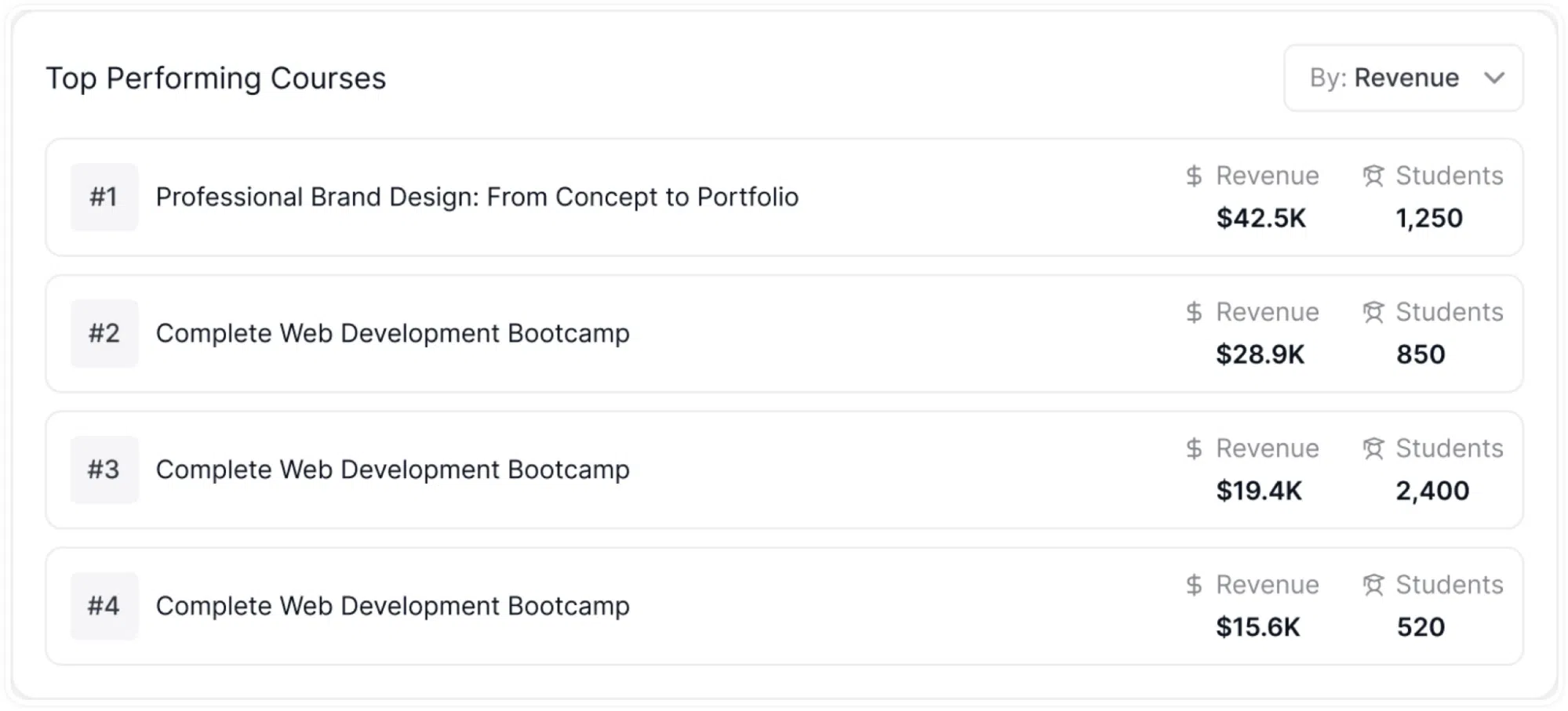
Each row in the list shows the course’s rank, the full course title, the total revenue the course has generated, and the number of students enrolled in it.
Upcoming Live Classes
Directly below the Top Performing Courses list, the Home page displays an Upcoming Live Classes section. This widget lists your scheduled live sessions in chronological order, so you can see at a glance which classes are coming up next.
Each session entry in the list shows the following information:
- The date and time of the session.
- The lesson title associated with the session.
- A Live Session button, alongside the session entry.
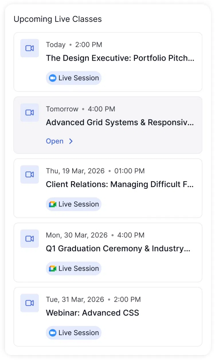
The Live Session button allows you to join an active or ready session directly from the Home page, without having to navigate to the Live Classes section first. If a session is currently running, clicking this button will take you straight into it.
Recent Activity
To the right of the Upcoming Live Classes section, the Home page displays a Recent Activity feed. This feed shows a real-time log of the latest actions taken by your students across all your courses.
Each entry in the feed includes:
- The student’s name.
- The action they took, described in plain text, for example, submitted, enrolled in, or completed.
- The name of the relevant course or item.
- A timestamp showing how long ago the action occurred.
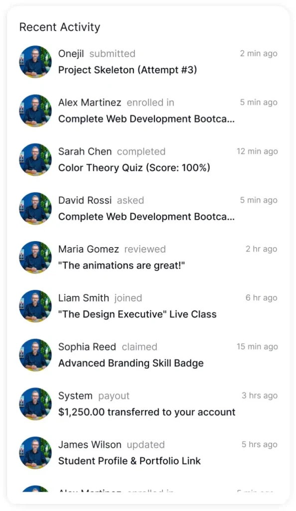
The feed updates continuously as student activity happens on your platform. If you have a large number of students across multiple courses, this section makes it possible to stay informed about what is happening without opening each course individually.
Recent Student Reviews
At the bottom of the Home page is the Recent Student Reviews section. This displays the latest reviews left by learners on your courses, presented as individual review cards stacked vertically.
Each review card contains the following:
- The student’s profile photo and name.
- A course tag showing which course the review was left on.
- A timestamp indicating when the review was submitted.
- A star rating displayed in gold, out of five stars.
- The full written review text left by the student.
- A Reply link below each review, which you can use to respond to the student’s feedback.
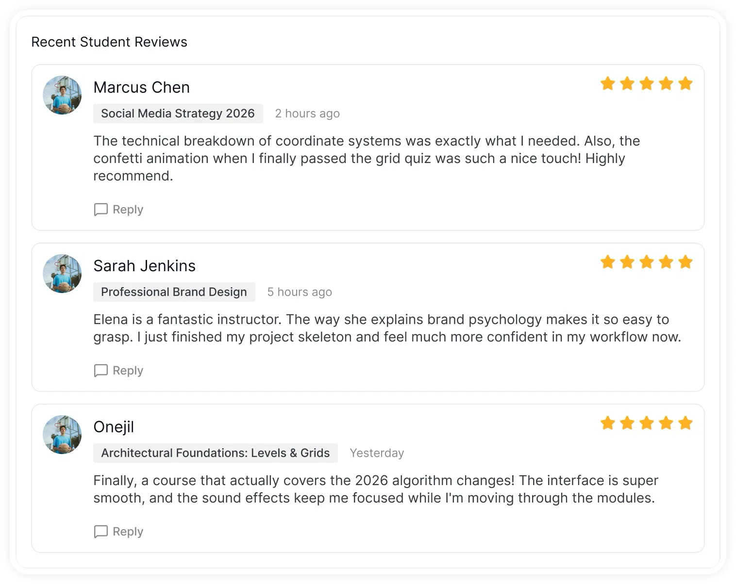
This section allows you to read incoming reviews as they are submitted, without having to go into the Analytics section or navigate to an individual course. It serves as a continuous feedback channel that is visible every time you open the dashboard. If a review raises a concern or contains particularly positive feedback, you can use the Reply option to respond directly from this section.