Analytics
The Analytics section provides detailed reporting on your earnings, courses, and student activity. You can access it by clicking Analytics in the sidebar. The section is divided into six sub-tabs, each covering a different area of your performance data.
The Overview Tab
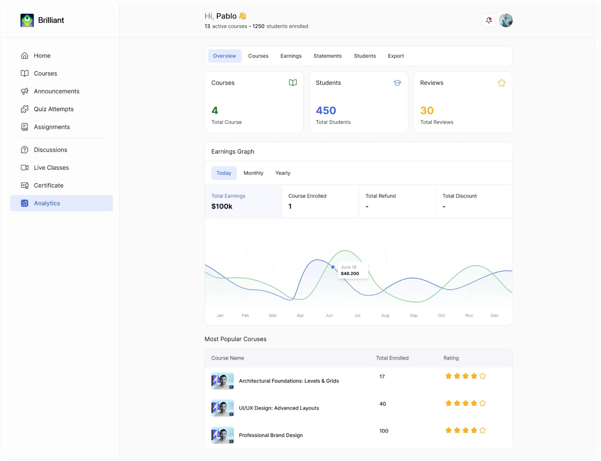
The Overview tab is the default view when you open Analytics. It is divided into three parts: summary cards at the top, an earnings graph in the middle, and a most popular courses table at the bottom.
Summary Cards
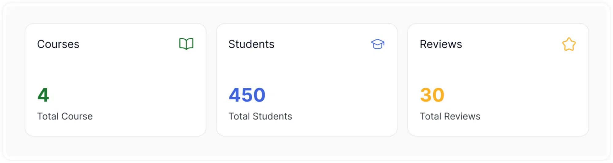
Three cards display your top-level numbers:
- Courses: The total number of courses you have created, shown in green with a book icon.
- Students: The total number of students enrolled across all your courses, shown in blue with a graduation cap icon.
- Reviews: The total number of reviews your courses have received, shown in gold with a star icon.
Earnings Graph
Below the summary cards is an Earnings Graph section. Three toggle buttons, Today, Monthly, and Yearly, allow you to switch the time period the graph and metrics below it reflect.
Beneath the toggle buttons, four metrics are displayed in a row:
- Total Earnings: your cumulative revenue for the selected period.
- Course Enrolled: the number of course enrolments during the selected period.
- Total Refund: the total value of refunds processed during the period.
- Total Discount: the total value of discounts applied to orders during the period.
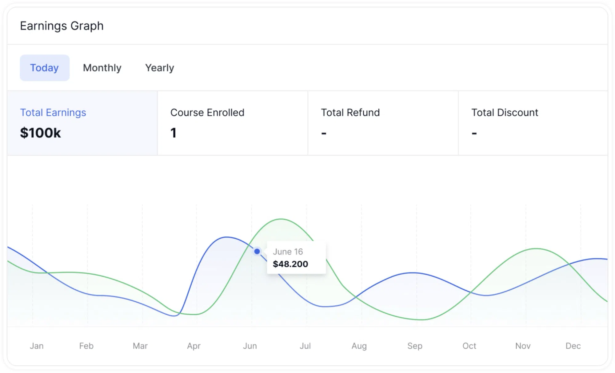
A dual-line chart sits below these metrics, plotting Earnings and Enrolled numbers over the selected time period in the same format as the Home page chart. Hovering over any point reveals a tooltip with the exact date and value.
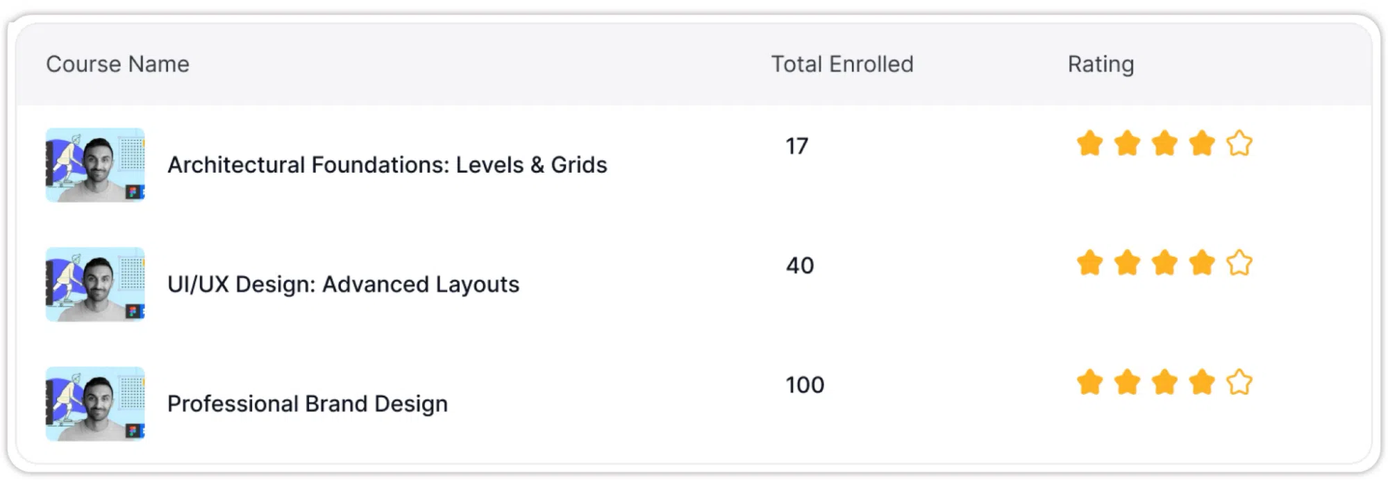
Most Popular Courses
At the bottom of the Overview tab, a table titled Most Popular Courses lists your courses ranked by enrolment. Each row shows the course thumbnail, the course name, the Total Enrolled count, and the course’s star rating displayed in gold. This gives you a quick comparison of which courses are attracting the most students and how they are rated.
The Courses Tab (Analytics)
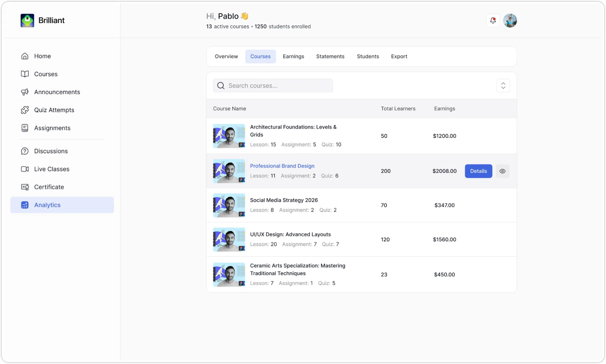
The Courses tab displays a complete list of all your courses alongside their key performance numbers. It gives you a per-course breakdown without leaving the Analytics section.
The Course List
Each row in the list shows:
- A course thumbnail on the left.
- The course name as a clickable blue link.
- A content summary beneath the name showing the number of Lessons, Assignments, and Quizzes in that course.
- Total Learners: the number of students enrolled in that course.
- Earnings: the total revenue that course has generated.
A search bar at the top of the tab allows you to filter the course list by name. As you type, the list narrows to show matching courses. A sort control on the right side of the search bar lets you reorder the results.
A Details button appears on the right side of each course row when you hover over it. Clicking Details opens a dedicated analytics page for that specific course.
The Course Detail Page
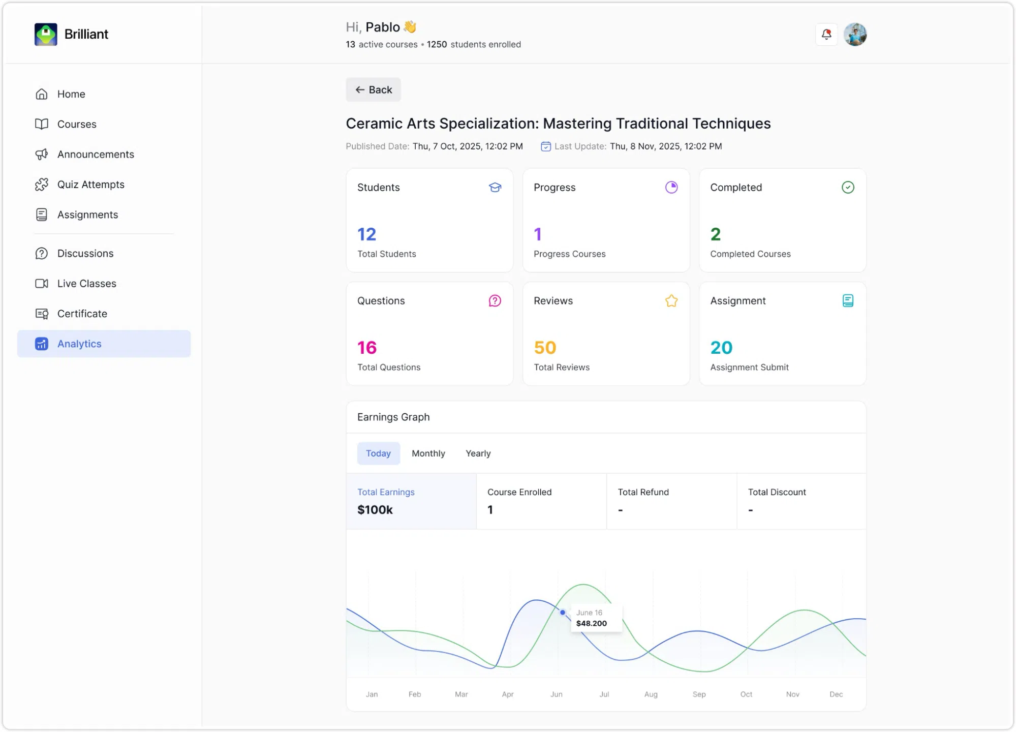
The course detail page shows several details regarding the selected course. This includes the course Name, Published Date, and Last Update date are displayed.
Also, six summary cards show at a glance:
- Students: Total enrolments for that course.
- Progress: Students currently in progress.
- Completed: Students who have finished the course.
- Questions: Total discussion questions submitted in that course.
- Reviews: Total reviews the course has received.
- Assignment: Total assignment submissions.
Below the cards, a course-specific Earnings Graph repeats the same Today/Monthly/Yearly toggle structure from the Overview tab, with its own Total Earnings, Course Enrolled, Total Refund, and Total Discount metrics, and a chart specific to that course only. Instructors can use the Back button at the top to return to the Courses tab.
The Earnings Tab
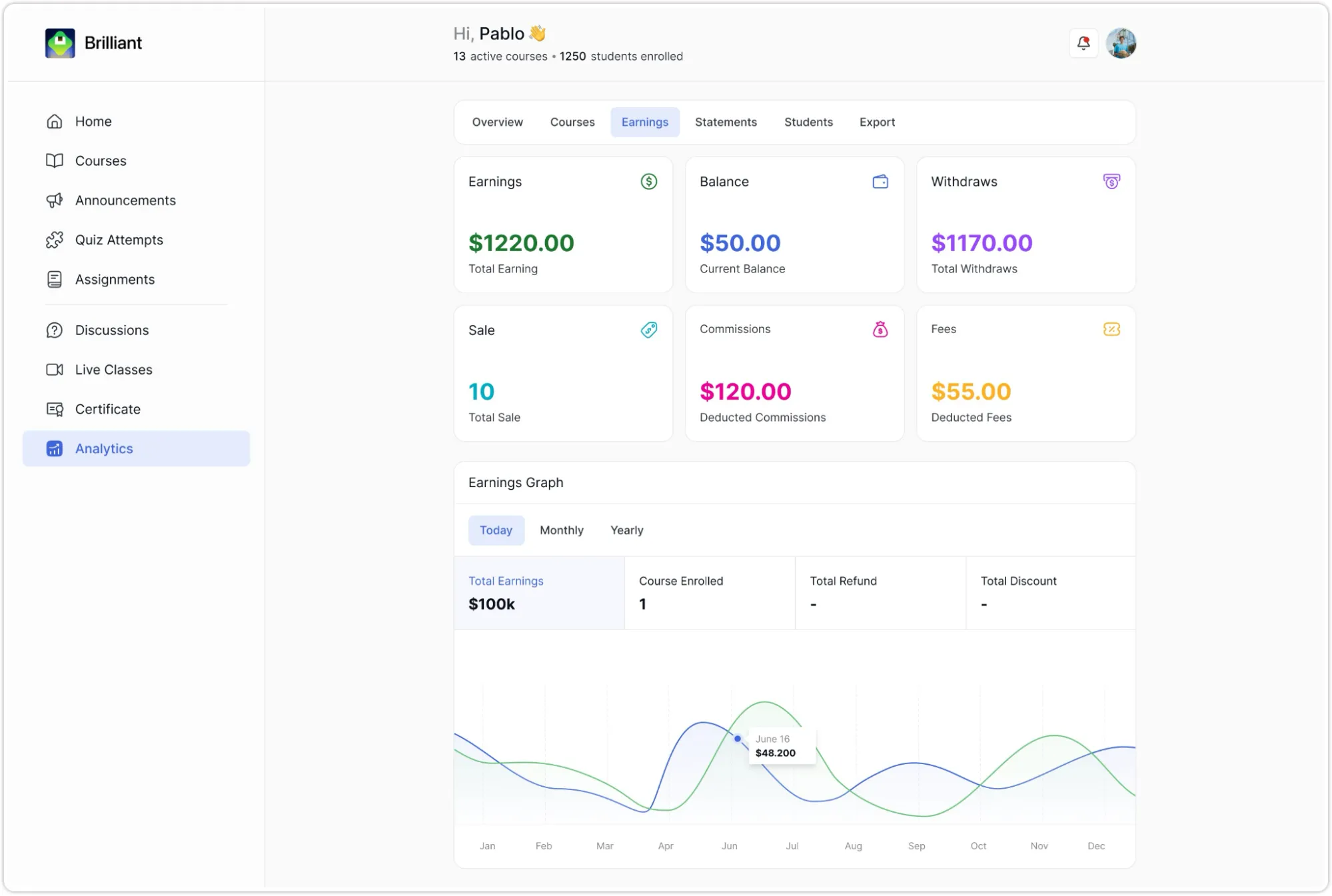
The Earnings tab provides a more detailed financial summary than the Overview tab. It separates your money into six distinct categories, displayed as cards across the top of the page:
- Earnings: The net amount of revenue you have received after deductions, shown in green.
- Balance: Your current available balance that has not yet been withdrawn, shown in blue.
- Withdraws: The total amount you have withdrawn from your earnings so far, shown in purple.
- Sale: The total gross value of all sales made, before any deductions, shown in green.
- Commissions: The total commission amount deducted from your sales, shown in pink.
- Fees: Any platform fees charged against your account, shown in gold.
Below these cards is an Earnings Graph section with the same Today, Monthly, and Yearly toggle buttons. The metrics shown beneath the toggle in this tab are:
- Total Earning: Your net earnings for the selected period.
- Number of Sales: How many individual sales were made during the period.
- Commission: The commission amount deducted during the period.
A line chart below these metrics plots your earnings trend for the selected time period.